


Wednesday, 18 April 2012
Thursday, 5 April 2012
The Hidden Strengths of Volume Analysis - Part 2
In part 1, I discussed two examples of how and why volume can show the changing face of supply and demand. When the order of supply and demand is change we will get a change in market direction, sometimes a significant change in trend or otherwise some degree of retracement of the prior move. We will now continue on from that discussion and show larger periods of transition which can lead to quite substantial turning points in the major trends. These can be easy to identify, but do require some patience. If you did not read the prior article it would now be worth reviewing that before going on.
Let’s firstly take a look at AWB Limited.
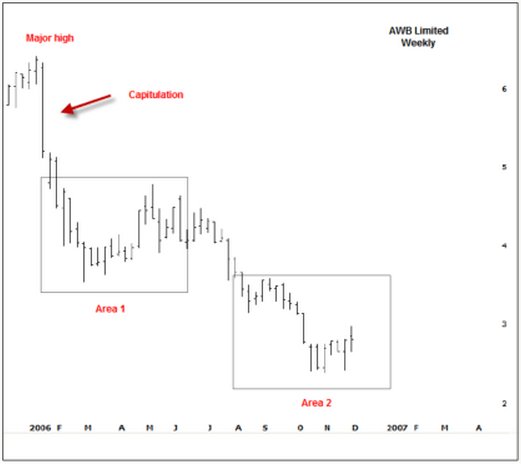
Since early 2006, the price of AWB had been in a downward spiral. The story that eventually came out suggested AWB was doing some bad business against the UN sanction in Iraq. The initial shock sent the shares plunging by 18% in a single week.
This is a sure sign of a change in sentiment and it’s not exactly rocket science to know there must have been some kind of bad news that changes the outlook.
But what is important here is that this significant sell off is actually the first sign that strength may start to appear in the near future. As I discussed in part 1, demand strength actually starts in price weakness and here is a sign of capitulation. A wide ranging bar on increased volume is a sign of panic and when we see panic we can usually expect that a bargain could be in the offering, but this is where the patience is required. What we usually start to see after capitulation is a transition from sellers to buyers. This transition has two important characteristics; firstly it takes some time and secondly prices do tend to drift lower. Let’s zoom into the AWB chart at Area 1 and also add our volume indicators.
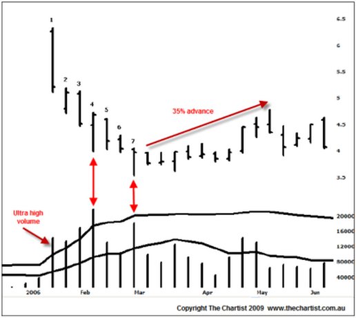
Bar 1 is the capitulation; a very wide ranging bar and ultra high volume. Remember that ultra high volume is signaled when the volume histogram penetrates the volume Bollinger band. Bar 2 gaps lower but closes on the weeks high and does so on high volume. This is a sign that the Smart Money is interested in buying. There is no other way that prices can close higher on increased volume if buyers were not involved. Bar 3 however shows sellers returning; a push lower, a low close and another increase in volume. Bar 4 is the turning point and is a sure sign that buying interest is occurring. This is the time to start thinking that this market will turn higher soon. This bar shows a move to new lows but a complete rejection, i.e. a high close and very high volume. We’re seeing the Smart Money taking positions, even though the stock is drifting lower. Now take a close look at bars 5 and 6. What happens? Essentially they are inside days with a slight downward bias but look at the volume? There is none. Volume has dried right up. This means that sellers are done; they’re exhausted. Those that wanted to sell have either been fulfilled or do not wish to chase prices any lower. Bar 7 sees another probe lower, another high close and yet again a rapid increase in volume. Combined with bars 2 and 4, both of which show background strength, this is continued evidence that the stock is being accumulated. It’s only a matter of time before enough of the supply has been accumulated that prices will start to rise again.
For the next 2 months AWB rallied 34% off that exact low. The first signs of upward price momentum would be the signal to initiate longs. We have the Smart Money footprints in the volume so we just need to time the entry for our own comfort. Take a look at the bars from that low. All down bars had low volume; all up bars had high volume. There was a specific transition from sellers to buyers which led to a reasonable, albeit unsustainable, price rise.
The following chart shows that advance in more detail. Bar 8 was a very promising bar indeed; a wide range higher, a high close and a good increase in volume. With the high close we can deduce that buyers had the control. Bar 9 is an important bar for current longs. It shows an attempted push higher, a reasonably tight range but more importantly a weak close and solid increase in volume. This is the first time that sellers had come back to the market. Now these sellers can originate from two sources; either profit takers that bought at lower levels, after all, it was a rapid rise in quick time which will always create profit taking; or it is very old longs who were waiting for the evitable bounce to get out of their positions. We’re not to know which, but what we do know is that selling has emerged and that caution is required.
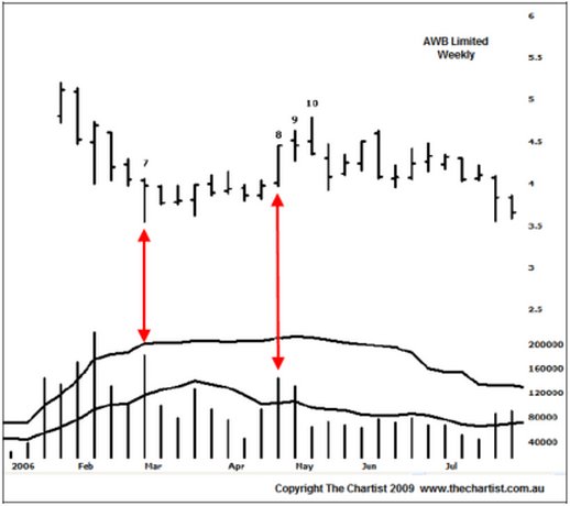
Bar 10 shows a rise into new recent highs but a close on the absolute lows. This is of paramount importance – what does it mean? Bar 9 identifies sellers because we had a weak close on high volume. Immediately following, Bar 10 shows a low close on low volume, which suggests buyers have disappeared. If buyers have gone, who is going to support the market if those sellers from Bar 9 decide to chase prices lower? Nobody. If there is no buyer demand or buyer support then prices have the risk of falling until buyer demand comes back again. And that is exactly what has occurred.
The Hidden Strengths of Volume Analysis - Part 1
The power of correct volume analysis cannot be overlooked. Unfortunately the ability to read volume correctly is not readily discussed or freely available. Off-the-cuff remarks such as, “increased volume on advances is bullish and increased volume on declines is bearish” are bantered around but that’s as far as it goes. The correct use and application of volume can make for some quite startling insights into price action, especially when one is swing trading or leaning against support and resistance points or zones of confluence.
I set up my charts with a couple of extra volume measures. I use a normal volume histogram that can be found with almost all software packages. However, if there is a larger volume spike skewing the ability to read the volume properly I will edit the data accordingly. Next, I add a 10-day moving average of the volume. This gives me a guide as to what is below average or above average volume on any given day. Lastly, I add in a 2- standard deviation of the 20-day volume average. Essentially this is like the upper Bollinger band of the volume average. This shows me when ultra-high volume occurs
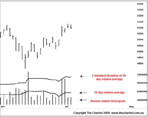
Figure 1: Chart Setup for Volume Analysis
With these added extras we can quickly gauge the personality of the day’s volume as well as benchmark it against the surrounding volume. The exact volume reading is not important. The concept of relative volume is the key.
I’m going to make reference to The Smart Money throughout this article. The definition I use for the Smart Money is:
A group of professional users that act in unison at very specific levels and points of time to change the order of supply and demand.
The Smart Money are the one’s who constantly buy the lows and sell the highs. Let me say that this is not a bunch of traders ringing around attempting to manipulate the price. We don’t need to know who or why but these are the people we wish to follow. We do so by watching their footprints, and their footprints are shown within the daily volume. The Smart Money will show their hands by selling into strength and buying into weakness. As the Smart Money can change the order of supply and demand we can therefore ascertain that strong price action may in fact contain weakness and weak price action may in fact contain strength. I appreciate this may go against most things you’ve learnt about volume but it’s important to keep that thought in the back of your mind. Increased supply, and therefore weakness, may occur during price strength. Increased demand, and therefore strength, may occur in price weakness.
The first thing to understand about volume is that it’s not just the volume by itself we’re interested in. At any particular price a major misconception is to think that for every buyer there is a seller and in turn volume is null and void. If that were really the case then prices would simply not move. What drives prices is the fear and greed of the buyers and sellers. It’s therefore the relationship and interaction between volume and price that shows us what is really occurring in the market. Think of volume as the effort of one side and the price activity as the result of those efforts. If sellers are desperate to exit then they will be more inclined to sell at the bid rather than sit back on the offer. If there is not much buying demand below the market then prices are going to be driven lower until those sellers are fulfilled or are unwilling to pursue prices any lower. Conversely, if buyers are desperate they will buy the offer and not sit on the bid. If buyers are desperate and there is not much supply above the market then you’re going to see prices move up until those buyers are fulfilled or unwilling to pursue prices any higher.
The mantra of volume analysis is:
“What is the result of the effort?”
The most basic example of a volume/price relationship pattern is a straightforward blow-off top or bottom. As technicians we all know what these are and we also know what they tend to mean. Figure 2 shows a perfect recent example of a blow-off bottom in Lihir Gold (LHG).
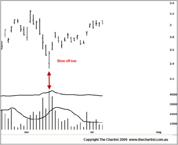
Figure 2: Typical blow-off low in LHG
The gap opening on that low day means sellers were indeed desperate. There is no other way to account for that gap except simple selling pressure. They over-ran all buyer demand until they were fulfilled. They even managed to keep pushing prices lower. But remember, previously I suggested that demand strength occurs in price weakness. LHG had certainly been declining up until that point. So, if there was no demand strength, how could prices rise from thereon?
The demand strength is shown by the effort and the result. Effort was certainly very high because volume was very high, in fact ultra high. This means a substantial number of transactions took place between buyers and sellers. But, what is the result of that effort? The result of that effort is that the market closed on its highs for that day which means that buyers have clearly over-powered the desperate sellers. When a lot of effort or a lot of volume takes place we know the Smart Money is involved because they are the big players and they are the one’s that can change the course of supply and demand. This is a prime example where the Smart Money has decided that LHG is a value buying proposition and they move into the market to absorb the selling volume. They are the stronger party. It’s the weaker hands capitulating. This is why I said that demand strength will appear on weakness. If the Smart Money have absorbed all the selling volume and the sellers are fulfilled, how can prices go any lower? They can’t, is the answer. And if prices can’t go lower then they will tend to go back up because now there is no overhanging supply capping the market.
Let’s look at the exact same concept but without the blow-off. Remember the core thinking; increased supply and therefore weakness may occur during price strength and what is the result of the effort?
Again we’ll use LHG but note this time the absolute high bar is a very small tight range and not the standard blow-off that we’re normally used to seeing.
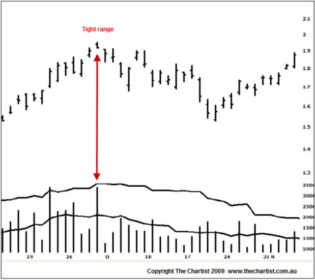
Figure 3: The Smart Money appears at the absolute high
Firstly, the volume is extremely high, almost ultra high. We therefore know there are a lot of transactions taking place and in turn a lot of effort being put into the day. So what is the result of that effort? A very tight range with the close on the lows and below the open. What does it suggest? Clearly the sellers have overpowered the buyers. The buyers must have been desperate because prices have been gapping higher and they were most likely desperate from probable good news.
Ever heard the saying, “buy the rumour, sell the fact”? Do you ever wonder why prices go down after a positive announcement? Do you think the Smart Money knew the facts or the good news beforehand and the reason why they’re already long? I think so. So when the good news is announced to the market all the weaker hands jump in and start buying and the Smart Money take the opportunity to offload their positions into the demand strength.
Look at that LHG chart again in Figure 3. Prices were already trending higher. The Smart Money has already bought because they knew what was coming. When the announcement came they took their profits and sold their positions to all the latecomers. The force of buying from all the latecomers was large. We know this because the volume was high. But the force of the Smart Money selling and standing firm in the face of large buying was even larger and is why the days range was so small. If the Smart Money thought prices were going to travel higher, then they would not be selling and we would’ve had a wide ranging up day on light volume. But because the Smart Money knew that prices would most likely not go any higher, they stood their ground and simply offered their supply into the buying from the weaker hands.
Let’s think about what all those weaker hands are thinking at the close of that session. Good news has been announced. I bought the stock accordingly but it’s now closed below where I purchased it so I’m wearing a loss immediately. You can see them almost scratching their heads! Because the Smart Money had absorbed all the buying demand there is now no follow through buying demand. All the weaker hands are all of a sudden slightly nervous. Any slight weakness will see them exit their positions. They wait a day or so in wonderment but look at what occurred on the 3rd day after the high. A down day on increasing volume. Those weaker hands that bought the highs have had enough and are getting out whilst they can. They walk away with yet another loss but none the wiser as to why prices didn’t go higher on the good news.
So whenever you see a very tight range at new highs or lows that is accompanied with ultra high volume, you know the Smart Money is trading the other way. They are large enough to change the trend so you’d better listen. These are two simple examples of reading volume correctly. There are many more to be aware of, but remember the mantra, “what is the result of the effort?”
The best book on volume/price analysis is Master the Markets by Tom Williams who is the Richard Wyckoff of the modern era. Its 190-pages packed with volume and price characteristics and I rank it as one of my top-5 trading books ever.
Nick Radge can be contacted at The Chartist
Subscribe to:
Posts (Atom)