This is default featured slide 1 title

Go to Blogger edit html and find these sentences.Now replace these sentences with your own descriptions.

This is default featured slide 2 title

Go to Blogger edit html and find these sentences.Now replace these sentences with your own descriptions.

This is default featured slide 3 title

Go to Blogger edit html and find these sentences.Now replace these sentences with your own descriptions.

This is default featured slide 4 title

Go to Blogger edit html and find these sentences.Now replace these sentences with your own descriptions.

This is default featured slide 5 title

Go to Blogger edit html and find these sentences.Now replace these sentences with your own descriptions.

Sunday 3 October, 2010

Anatomy Of A Stock Breakout


Here's a great example of a breakout trade for a very short-term stock trader. This is the kind of pattern that can work well in trading competitions, such as the one sponsored by CNBC. First, we look for the opening trading range of the first 15-30 minutes. The opening range tells us how market makers are establishing value for the stock (National Semiconductor, NSM; 5 minute bar chart). Note that the opening range (Point A) is above the prior day's close. That tells us that we are seeing increased value being placed in the stock.

At Point B we see a breakout from the opening range on increased volume. That tells us that large market participants are viewing the stock positively, jumping in to buy at new AM highs.

Point C represents the first pullback from the breakout, as some short-term participants take profits. When we see a shallow pullback on reduced volume, as we do here, it tells us that the higher prices are not attracting significant selling. This sets us up for further upside (Point D).

At each pullback in the stock (the horizontal blue lines), we see how far sellers could knock the issue down. Once we get a new move to daily highs, those blue lines can serve as trailing stops to lock in profits.

The nice thing about such setups is that it only takes a few winners to pay for a number of ideas that chop around and don't do much. A majority of profits will come from a handful of nicely trending trades.

via - http://traderfeed.blogspot.com/2007/03/anatomy-of-stock-breakout.html

Friday 17 September, 2010

How I Came Back From My Worst Loss

Mohammed Isah is a private trader and an independent technical analyst. He initially traded stocks and now primarily focuses on forex. You can contact Mohammed on his pivot points reports and other inquiries at:isahmo@gmail.com.

Trading is an interesting profession and has no peak as in other occupations. It is in fact an endless journey of discovery of oneself and trading itself.

Trading for me at beginning was very tough not that I was not successful in other endeavors but I took it like every beginner thinking that it was easy.

With this perception, I approached trading without a plan or proper trading education on how the market works. What do you expect? Your guess is as good as mine. It was a total disaster after taking many losses; I was almost psychologically blown a way. At this stage, two important things happened to me, my P&L was in the red and I was down emotionally.

My Worst Trade

My worst loss that stands out in all my losses was a trade I took (bought EUR/USD) in anticipation of French Referendum thinking that it would be in favor of the European Union but alas I got a margin call after the result was negative.

Please do not ask me about a stop loss I did put a stop loss but I later removed it because I was so confident it was going to be a winning trade. Hey, can't you understand. I have been declaring losses so I thought this time round I would take a large position and cover all my losses. I was subsequently charged to court (trading), tried and found guilty (for losses). Punishment, six months without trading. While serving my term I embraced trading education especially technical analysis and trading psychology. So when I got a handle of certain strategies applying technical analysis and trading psychology I started trading again but not without losses but I followed my trading plan anyway and things improved especially when I became comfortable with losses as expenses in the business of trading.

Lessons

Never Trade Without A Trading Education - acquire proper trading education because the knowledge through trial and error in the market can be more expensive and time consuming than the normal trading education.

Never Trade Without A Plan - Having a trading plan is a most in this business if you want to succeed. This plan most specify and predetermine your entries, exits, stop loss, position size and your psychology (your emotion at the time you click enter). There could be more you could have on your plan but the most important thing is that you must follow it, because when you follow your plan you have a chance of succeeding in trading. You may be tempted to say do I have to follow this damn plan everyday, just go to a near by Airport and observe what pilots do everyday; they follow their plan and check each one before taking off. He can as well say, I feel better flying without my plan because I do it every time. That you know will be disastrous.

Do Not Be Smarter Than Your Emotion -What do traders do when they are tired? They wait for an opportunity instead of turning off their computers and call it a day they stay on waiting to initiate a position and when the trade turns out to be a loser they become angry adding to the tiredness. Hey, you know what, you can not win at trading if you are not in your right frame of mind. If you have problems with your spouse please do not trade, if you have a string of losses do not trade, take some time off and go over your losses until you know what went wrong before you can put on another trade. If any thing occupies your mind apart from the market and following your trading plan when you are ready to trade, do all you can to resolved it before you start trading for the day. If you cannot go golfing.

Cut Your Losses Shut And Let Your Winners Run -This one sounds familiar, right.The professionals do exactly as is stated here but what do novice traders do? They do the opposite by letting their losses run and cutting their winners shut.

In other words, they are patient with their losses and impatient with their winners thinking that their positions would come back. The hard truth is the market does not know whether you are winning or losing. It will go wherever it wants to go and do what it has been doing, which is moving up and down. It is now left to you to find opportunities within these up moves and down moves.

Becoming A Professional Trader Takes Time - This might sound funny. Do not ask any trader to tell you how many years it will take you to become a professional/experience trader. The truth is that real professional traders know that the education of a trader never ends. It is ongoing because market is not static, it changes so if you think you have acquired enough trading knowledge and market conditions change and you cannot cope with the changes you automatically become a learner. The fastest way to become a good trader is to learn from the professional traders (their strategies and how they apply them) taking into consideration your own psychological make up.


via - http://www.tradingmarkets.com

Thursday 26 August, 2010

What a successful daytrader does daily!

Before diving into Day Trading, please ask yourself if you have the following personality traits!

Confidence
This is perhaps the most important personality trait of good day traders. You won't succeed at day trading unless you have a high measure of confidence in yourself. Lack of self-confidence will result in doubt, indecision and second-guessing which, in turn, will lead to missed trading opportunities and frequent losses. You must believe in yourself when day trading. If not, you will be better off pursuing some other endeavour.

Discipline
In order to day trade successfully, you must develop a trading plan and consistently stick to it. You must avoid a "shooting from the hip" or a "seat of the pants approach" to day trading.

Get out of the market when you have reached your objective and do not let emotions like fear and greed influence your trading decisions.

Decisiveness
Good day traders do not hesitate to "pull the trigger" when entering and exiting trades. Traders who are in the habit of being tentative or indecisive will never become successful.

Passion
Most successful day traders have a true love or passion about their trading activities. If you do not enjoy reading charts, dealing with numbers, reading market news, interpreting quote screens, learning new trading strategies and working independently in a fast-paced environment, then day trading is probably not your cup of tea.

Ability to Accept Failure (and blame yourself for all failures)
Good day traders know that many of their trades will fail to meet the original objective. They do not, however seek to blame someone else for their loss, and they don't dwell on it. They attempt to learn from their mistakes and move on to the next trade.

Ability to Accept Risk (lose money)
Another personality trait of good traders is that they are comfortable with risk and are prepared to lose money from time to time. If you are afraid that you will, on occasion, lose money, then day trading is not for you.

Patience
Good traders do not rush into trades. They take the time to select good trading opportunities and do not place orders simply for the sake of holding a position in the markets at all times. On some market days, where few good trading opportunities exist, they are content to simply stand aside and wait.

Concentration
In day trading, a great deal of real-time information has to be absorbed, analyzed and acted upon in intense bursts throughout the trading day. This requires a great deal of concentration and stamina on the part of the trader, and the ability to avoid distractions. Day trading can be very hard work and a lack of concentration can doom a trader to failure.

These are the key personality traits that successful day traders tend to have in common! Do you??

Sunday 22 August, 2010

Multicollinearity

Multicollinearity is a statistical term for a problem that is common in technical analysis. That is, when one unknowingly uses the same type of information more than once. Analysts need to be careful and not utilize technical indicators that reveal the same type of information.

Here is how John Bollinger states it: "A cardinal rule for the successful use of technical analysis requires avoiding multicollinearity amid indicators. Multicollinearity is simply the multiple counting of the same information. The use of four different indicators all derived from the same series of closing prices to confirm each other is a perfect example."

The issue of multicollinearity is a serious issue in technical analysis when your money is at stake. It is a problem because collinear variables contribute redundant information and can cause other variables to appear to be less important than they really are. One of the real problems is that sometimes multicollinearity is difficult to spot.

Technical indicators should be arranged in categories to keep from using too many from the same category. Here is a table that categorizes the indicators available at StockCharts.com:

CategoryIndicators
MomentumRate of Change (ROC)
Stochastics (%K, %D)
Relative Strength Index (RSI)
Commodity Channel Index (CCI)
Williams %R (Wm%R)
StochRSI
TRIX
Ultimate Oscillator (ULT)
Aroon
TrendMoving Averages
Moving Average Convergence Divergence (MACD)
Average True Range (ATR)
Wilder's DMI (ADX)
Price Oscillator (PPO)
VolumeAccumulation Distribution
Chaikin Money Flow (CMF)
Volume Rate of Change
Volume Oscillator (PVO)
Demand Index
On Balance Volume (OBV)
Money Flow Index

The best way to quickly determine if an indicator is collinear with another one is to chart it. Make sure you have enough data on the chart to get a good indication. If they basically rise and fall in about the same areas, the odds are that they are collinear and you should just use one of them.

The first chart below shows some examples of indicators that are collinear. Notice that all three indicators are basically saying the same thing. If your analysis was that this was supportive information, you would be falling into the multicollinearity trap. Pick one of the indicators for your analysis and do not use the others.

Hewlett-Packard Co. (HPQ) Multicollinearity example chart from StockCharts.com

Below are some examples of indicators that are not collinear. These three are not similar at all and, when interpreted correctly, each will give different information. It may be supportive or it may not.

Hewlett-Packard Co. (HPQ) Multicollinearity example chart from StockCharts.com

Bottom Line: If you are randomly selecting indicators to support your analysis, you will more than likely fall into the multicollinearity trap of using multiple indicators that are all saying the same thing. They are not giving you any additional information; in fact, they are restricting your overall view of the market. Don't search for supporting information among collinear indicators, it is just misleading


via - http://stockcharts.com/help/doku.php?id=chart_school:trading_strategies:multicollinearity

.

Thursday 22 July, 2010

5 minute intraday trading strategy

This strategy is originally created by Philip Nell a veteran stock trader with more then 10 years experience. This has been tested for trading EUR/USD and GBP/USD. I like the way it define market motion. Though this is a great trading system, I personally don’t use this since I don’t like trading in 5 minute time frame.

It’s quite simple, what you need is 50 SMA, 21 EMA and 10 EMA attached on your 5M Chart. Open position when the angle of the 50 Simple moving average are greater than 20 degrees and the price retrace back into the zone of the 21 Exponential moving average and the 10 Exponential moving average. Set stoploss at 6 pips plus spread and profit taking at 8-10 pips. Move stoploss to breakeven as soon as 6 pips gain is obtained.

Below are some pictures for your reference:
intraday trading chart

5 minute intraday trading strategy

5 minute intraday trading strategy

5 minute intraday trading strategy

via - http://www.forextac.com/5-minute-intraday-trading-strategy.html

Tuesday 22 June, 2010

200Day Moving Average

Granville a respected analyst lists eight basic rules for interpreting the 200 day moving average charts.

1. If the 200 day average line flattens out or advances following a decline, and the price of the stock penetrates that average line on the upside, this constitutes a major buying signal.
2. If the price of the stock falls below the average line while the average line is still rising, this also is a buy signal.
3. If the stock price is above the 200 day line and declines towards it, but fails to go through and instead it turns up again, this is a buying signal.
4. If a stock price falls too fast and far below a declining average line, a short term rebound towards the line may be expected.
5. If the average line flattens out or declines following a rise, and the stock price penetrates that line on the down side, this constitutes a major selling signal.
6. If the price of the stock rises above the average line while the average line is still falling, this also is a selling signal.
7. If the stock price is below the average line a rises towards it, but it fails to go through and instead turns down again, this is a selling signal.
8. If the stock price rises too fast above a rising average line, a short term reaction may be expected.

Wednesday 12 May, 2010

Phil Newton's Break out Strategy


Saturday 8 May, 2010

BANDS AND BANDS AND CHANNELS

Trading bands and trading channel are related. Both chart patterns act as a restraint on price activity, confining it within defined boundaries. The channel defines trend behaviour. The band defines support and resistance behaviour and can be used to set price targets.

The trading channel is constructed with two trend sloping trend lines. These are parallel lines and as with any trend line, their value changes daily. The lines show changing sentiment about value. A trading channel shows the limits of this changing sentiment as price bounces from support and retreats from resistance.

The trading band is defined by support and resistance levels where the value remains constant. These are horizontal parallel lines. Price stops trending and develops a sideways movement. These patterns are more useful because they are used to project upside and downside targets. When price moves above the resistance level then the width of the trading and is used to set the potential upside target.

Both trading bands and trading channels are range-bound chart features. They provide short term trading opportunities as price moves between the support and resistance levels. However the range bound trend continuation of a trading channel is traded differently from the trading band with its potential for trade band breakout opportunities.

By Daryl Guppy

Friday 7 May, 2010

TREND LINE CONSTRUCTION

Look at the chart display. What is the trend for prices? Quite clearly they are going down. If we already have purchased this counter at $7.50, we should be worried. If we are potential buyers of this counter then the price move or break above $6.70 gives us a reason to buy the stock. The trend line gives us a way to decide which price action is significant, but only if it is accurately drawn.


We use a straight edge trend line to tell us which direction prices are moving and to give us a better way to judge the trend. If prices close under the up trend line then it suggests the stock price is falling. Ideally we would want to get out to this stock, selling it to collect our profits and to protect ourselves against loss. We get this exit signal when there is a close, or a series of closes, below the trend line.

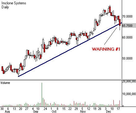
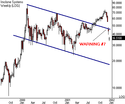
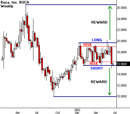
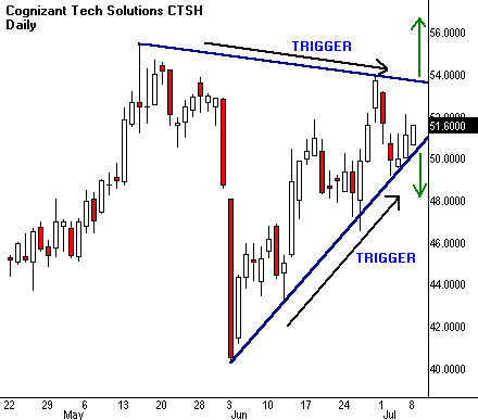
In a downtrend, the line is placed along the price highs. A close above this line tells traders the trend may be about to change direction. This is used as an entry signal. Where we draw the trend line is important because it could cost us money.


When we think about buying a stock many traders try to buy a trend breakout. This is when a downtrend turns to an uptrend and prices ‘break out’ above the trend line. Traders try to buy the stock near the bottom just as the stock price starts to move up. They get a buy signal when the price closes above the downtrend line.

Up trend or down trend, the principles of drawing the trend line are the same. An accurate trend line uses the information available from a bar or candlestick chart. Good trend lines need to use the high or the low prices for accuracy. They are not easy to plot accurately to a line chart.

These are the construction rules:


1) The line is placed along the lows of the price bars or candlesticks in a rising trend. An up trend is defined by higher lows each day. This is the price element we want to track, so the line goes underneath. If prices fall below this line then the trend may change into a downtrend.

A falling trend is defined by the failure of prices to make new highs each day. We track this by placing the downtrend line along the highs as shown in the chart.


2) The trend line uses the extremes of the price bars or candle sticks. This is the high or the low price. These extremes are important because a close beyond the extreme tells traders the trend might be changing. This is an entry, or an exit, signal.


3)The trend line starts at the very extreme high, or low. This is called a pivot point.


4) The trend line should touch the maximum number of possible price bar or candlestick extremities. This means we do not exclude too many, nor do we go for the maximum number of hits. We want to use the trend line as a trading signal, so we are interested in closes beyond the extremes of the existing trend because these give the best trading signals

5) The more often a trend line is hit by price extremes, but not broken, the more powerful the trend line signal. A trend line that has been hit 5 times, but not broken, is very strong. So when prices do close beyond the trend line it is a very strong signal that the trend is changing.


On the chart trend line 1 is a correctly drawn trend line. It touches the optimum number of price extremes. Trend line 2 shows the general direction of prices. Trend line 2 does not give any useful trading signals and prices move above and below this line all the time. Trend line 1 shows us when the downtrend has finished. The close above t trend line 1 clearly signals the beginning of a new up trend and provides an entry signal.


Straight edge trend lines are a very powerful trading signals, but they must be placed correctly. They are used to show the short term trend - perhaps days or weeks - the intermediate term trend - perhaps weeks or months - and the long term trend - perhaps months or even years. Long term trends are best seen on a weekly bar or candlestick chart.

Not all trends are easily defined with a straight edge trend line.


By Daryl Guppy

THE RELATIVE STRENGTH INDICATOR AND DIVERGENCE

Technical indicators are constructed by manipulating some aspect of price such as a moving average of prices over a 10 day period. The Relative Strength Indicator (RSI) tries to anticipate a change in the trend. This is a leading indicator of a trend change. The results are used to deliver messages about the strength of the market. It is called an oscillator because the indicator readings are converted into percentage results which range from 0% to 100%. The position of each day’s indicator reading gives the trader an indication of the strength, or weakness, of the existing price trend.
The RSI is calculated by monitoring changes in the closing prices of the stock. The number of higher closes is compared to the number of lower closes for the selected period. The RSI compares the internal strength of a stock by looking at the average of the upwards price changes and comparing it with the average of the downward price changes. The results are expressed as a percentage, providing the upper and lower boundaries. The plotted results oscillate between these two levels and give traders information about the speed and acceleration of the changes. Traders use either a 14, 9, or 7 day period in the Relative Strength Calculation.
In this sense the RSI is very similar to a stochastic and uses similar principles. Where the stochastic quantifies the ability of the market to close near the high or the low of the day, the RSI quantifies the strength of the way the market moves higher, or lower. The over-bought and over-sold signals are the same as any oscillator, although with an RSI they are traditionally set at 70% and 30%.
The most significant trading signal delivered by any oscillator style indicator is a divergence signal. This sounds complicated but it just means that the significant valley patterns shown by the RSI trend in the opposite direction to the significant valley patterns as shown by the price line chart. A valley is created by two distinct lows that each precede a rally from a downtrend. This builds a valley in the price chart. The lows of these valleys are joined with a short trend line as shown.
The corresponding lows on the RSI indicator are also joined by a short trend line. When the RSI line slopes differently from the price chart line, a divergence occurs. When these valleys form below the 30% area on the RSI, or form peaks above the 70% level, they are most reliable. Oscillator activity between these levels is not used to find divergence signals. Divergence signals give the trader an advantage by confirming an entry into a downtrend as it weakens and just before it turns into an up trend. It is also used to get out of an up trend as it weakens, and before it collapses into a downtrend. The divergence signal does not occur every time a trend changes, but when it does, it delivers a strong confirmation signal that a trend break is likely.
RSI divergence signals often appear in advance of a trend change, but they are not very good at suggesting the time of a trend change. The divergence signal may appear just as the trend changes, as in the chart extract, or several weeks before. Traders use the RSI divergence as an early warning signal to enable them to prepare for a trend change.
When the RSI and price chart lines move in the same way we get a confirming signal that the existing price trend is unlikely to change. These signals are not very important because we can get the same information from just looking at the chart.
The RSI is one of the very few oscillator style indicators where trend lines and support and resistance lines can be effectively used. These are used as signals to confirm the trend shown on the price chart. When other chart patterns suggest action, then the RSI trend line might also confirm this. When the RSI is used like this it does not give the trader any distinct advantage.

-
By Daryl Guppy

Friday 30 April, 2010

Gap Trading Tips

  1. Know the zone! Where the gap opens relative to prior day support and resistance (e.g. Open, High, Low, Close) will greatly influence its probabilities of filling, as well as the optimal placement of your stop and target.
  2. It’s a three legged stool. To maximize profits focus on gap selection, stop placement, and target optimization. It takes all three.
  3. Don’t try to kiss all the pretty girls (or guys)! With gap trading, it pays to be selective. So, when in doubt, sit it out.
  4. The return may not be worth the risk. Just because a gap is small and has a high probability of filling does not mean that it is worth trading. Profit expectancy, not probability of winning, is the key.
  5. Tis the season! Understanding the historical calendar tendencies of your market can help affirm a winning setup, as well as help you avoid losers.
  6. The worse it looks, the better it works. And vice versa (most of the time). Don’t let pre-market action overly influence your decision to fade a gap or not.
  7. The news is noise. Don’t worry about the financial or economic news that caused the gap. It will only add unnecessary confusion and second-guessing.
  8. Low hanging fruit is the sweetest. Entering at the market open catches all the easy winners. Waiting to enter after the open misses the easiest winners and catches all of the losers.
  9. Like money sitting on a table... Many gap setups are prone to continuing through the prior close after filling. Know the personality of your gap setup and when to hold through the gap fill for an extended target, or when to close before the gap fills.
  10. Size matters. Trade the position size that does not overly stress you, financially or emotionally, even if you have three or four losers in a row.
  11. Watch out for the BLUDs. Fading gaps Below the Low of a (prior) Up Day is only profitable about 50% of the time historically.
  12. The three amigos. Don’t forget about the other two gap plays: “Forget the Fade” (i.e. go-with) and “Fade the Fill.” They can add winning setups to your trading tool box.
  13. Focus on the horizon. Let the long term probabilities work to your advantage and don’t try to guess which trade will work or not. Have a plan, follow your rules, and accept that losers are the cost of doing business.
via - http://www.thegapguy.com

Saturday 20 March, 2010

9 Rules for Trading Divergences

There are nine cool rules for trading divergences. Learn 'em, apply 'em, and make money. Ignore them and go broke.

1.

In order for divergence to exist, price must have either formed one of the following:

Higher high than the previous high
Lower low than the previous low
Double top
Double bottom

Don't even bother looking at an indicator unless ONE of these four price scenarios have occurred. If not, you ain't trading divergence, buddy. You just imagining things. Immediately go see your optometrist and get some new glasses.

thumbs-up chart thumbs-up chart

2.

Okay now that you got some action (recent price action that is), look at it. Remember, you'll only see one of four things: a higher high, a flat high, a lower low, or a flat low. Now draw a line backward from that high or low to the previous high or low. It HAS to be on successive major tops/bottom. If you see any little bumps or dips between the two major highs/lows, do what you do when your significant other shouts at you - ignore it.

3.

Once you see two swing highs are established, you connect the TOPS. If two lows are made, you connect the BOTTOMS. Don't make the mistake of trying to draw a line at the bottom when you see two higher highs. It sounds dumb but peeps regularly get confused.

thumbs-up chart thumbs-up chart

4.

So you've connected either two tops or two bottoms with a trendline. Now look at your preferred indicator and compare it to price action. Whichever indicator you use, remember you are comparing its TOPS or BOTTOMS. Some indicators such as MACD or Stochastic have multiple lines all up on each other like teenagers with raging hormones. Don't worry about what these kids are doing.

thumbs-up chart

5.

If you drew line connecting two highs on price, you MUST draw a line connecting the two highs on the indicator as well. Ditto for lows also. If you drew a line connecting two lows on price, you MUST draw a line connecting two lows on the indicator. They have to match!

thumbs-up chart thumbs-up chart

6.

The highs or lows you identify on the indicator MUST be the ones that line up VERTICALLY with the price highs or lows.

thumbs-up chart

7.

Divergence only exists if the SLOPE of the line connecting the indicator tops/bottoms DIFFERS from the SLOPE of the line connection price tops/bottoms. The slope must either be: Ascending (rising) Descending (falling) Flat (flat)

thumbs-up chart

8.

If you spot divergence but price has already reversed and moved in one direction for some time, the divergence should be considered played out. You missed the boat this time. All you can do now is wait for another swing high/low to form and start your divergence search over.

thumbs-up chart

9.

Divergences on longer time frames are more accurate. You get less false signals. You will also get less trades but your profit potential is huge. Divergences on shorter time frames will occur more frequently but are less reliable. I personally only look for divergences on 1-hour charts or longer. Other traders use 15-minute charts or even faster. On those time frames, there's just too much noise for my taste so I just stay away.

MOVING AVERAGES: TRADING PATTERNS

Running Cup and Handle

The cup-and-handle (1) is typically a major reversal pattern that often precedes large rallies. It is formed when a stock sells off, bottoms, and then begins to rally, creating a "cup." After the rally, the stock drifts lower, forming the "handle" of the pattern. According to William O'Neil, who popularized the pattern, the best cup-and-handle candidates are stocks that already have staged a strong rally.

One way to measure the “strong rally” would be to use the 50-day moving average. As long as a stock remains above the 50-day moving average, it can be considered to be in an intermediate-term uptrend. Therefore, cup-and-handles that formed at or above the 50-day moving average are dubbed “running” as the market continues to “run” while the pattern is formed. The theory is that it combines a bottoming/correction formation with trend -- the best of both worlds.

moving  averages
Chart 1: Running Cup and Handle. Notice the cup forms at and above the 50-day moving average. Source: The Tradehard Guide to Conquering the Markets.

Expansion Pivots

As mentioned above and in previous articles, the 50-day simple moving average provides a point of reference for many institutions and large traders. Jeff Cooper has observed that “a stock will trade around its 50-day moving average for a period of time, and then without warning explode either to the upside or downside. This explosion often follows through for at least a few days…”(2). His strategy looks for a wide-range day that occurs in a stock that is trading at its 50-day moving average and then seeks to enter a position in the direction of that expansion.

moving  averages
Chart 2: Expansion Pivots. This set-up looks to enter on follow-through after wide-range movements at the 50-day moving average.

Holy Grail

In Street Smarts, Connors and Raschke showed that strongly-trending markets often retrace to the moving average before re-asserting themselves. If you think about it, this makes sense as markets often thrust/correct and then thrust again -- similar to the pullback pattern. Essentially the set-up looks for a strongly-trending market as measured by high ADX followed by a retracement to the 20-period exponential moving average. They jokingly dubbed this pattern the “Holy Grail”.

moving  averages
Chart 3: The Holy Grail. The pattern seeks to capitalize on a resumption of a strong trend as measured by a high ADX reading after retracements to the moving average.

Daylight Breakouts

Often, markets will trade around the moving average. They will have a slight rally (or selloff) and then return to the moving average. This is known as reversion to the mean (average) and has been discussed in previous articles. On occasion, the market will break free and begin to trend away from the moving average. While looking for a long-term trend-following system for the commodities markets, I notice that these trends or breakouts from the moving averages are often preceded by a period of at least two days, where the lows (for uptrends) or highs (for downtrends) fail to touch the moving average. This “gap” above and below the moving average was dubbed “daylight” by a fellow trader as you could see “daylight” in-between the price bar and the moving average. The original system, The 2/20-Day EMA Breakout System(3), used a 20-day exponential moving average and is described below in figure 1. Once the entry qualifications were met, a buy entry was placed above the two-bar high. Short sales are reversed. Setups for the pattern are shown in Chart 6, February 2000 Gold Comex.

moving  averages
Figure 1: The 2/20 EMA set-up. Source: Technical Analysis of Stocks and Commodities, December 1996 Issue.

moving  averages
Chart 4: February Comex Gold. Notice the 2/20 EMA Breakouts (or “Daylight” Breakouts) requires the market to trade above the two-bar high of the set-up for longs and below the two-bar low for shorts. If the market fails to pass these points then there is no trade.

Like most trend-following systems, Daylight Breakouts are prone to large drawdowns (losses to equity) when traded on a purely mechanical basis as markets only trend about 30% of the time. However, when used on a discretionary basis, combined with money management and/or additional technical indicators (i.e. a strong underlying trend) it can be a useful tool. Also, you might consider varying the lengths (and types) of moving averages used depending on your trading style. For instance, short-term traders may consider using a 10-period moving average whereas longer term traders may consider a 50-period moving average or longer.

Conclusion and Series Summary

In the first part of the series we defined the different types of moving averages. These included the simple, weighted and exponential moving averages. These different types of averages essentially behaved the same except in strong trends and breakouts when the weighted and exponential moving averages tended to “catch up” faster to current prices. In Part II, we looked at the characteristics of moving averages such as reversion-to-the-mean and the drop-off effect. We also looked at general uses which included support/resistance or reference points and using the slope of the moving average to measure trend. Finally, we showed more specific set-ups which seek to capitalize on these features.

So which moving average or set-up is best? It all boils down to personal preference and trading style. I encourage you to study the different types of moving averages and the above set-ups. Modify them to your liking or create your own methods.

By David Landry


200-Day Moving Average

STOCKS ABOVE THEIR 200-DAY MOVING AVERAGE

In today's article I will discuss another key item that I use to gain a comprehensive picture of the state of the overall market--the percentage of stocks now trading above their own 200-day moving average. (To avoid repeating this long phrase, I'll just refer to this indicator as "% above 200.")

The concept here is simple. The 200-day moving average is perceived to be the dividing line between a stock that is technically healthy and one that is not. (To review how to calculate a moving average, please visit this link.) Some traders use the simple moving average for this measure. Meanwhile, others employ exponential moving averages, which give more weight to recent data. A stock that is trading above its 200-day moving average is said to be in an uptrend and is being accumulated; one below it is in a downtrend and is being distributed.

On the surface, it seems as though the higher the "% above 200" goes, the more bullish the market is (and the lower it goes, the more bearish). In practice, however, the reverse is true. Extremely high readings are a warning the market may soon reverse to the downside. High readings reveal that traders are far too optimistic. When this occurs, fresh new buyers are often few and far between. Meanwhile, very low readings signify the reverse; the bears are in the ascendancy and a bottom is near.

So, now that we understand the significance of very high or low readings on this indicator, we need to determine exactly what levels represent high and low readings. To interpret this indicator, four parameters are key: 20 and 40 on the low side and 70 and 90 on the high side. Throughout the last 20 years, readings around 20 have consistently marked key reversal areas. As the chart below shows, the 20 level marked Wall Street's bottom in October 2001, late July 2002 and October 2002. (I've circled each of these reversal areas below). With this in mind, when the % above 200 nears the 20% level, swing traders should be on the alert for a sharp, V-shaped reversal.

When the percentage of stocks above their 200-day moving average hits 20%, the subsequent rally is often capped at the 40% level. This level provided resistance in August 2002 and January 2003 and correlated with bear market rally peaks. When the official bull market began in March 2003, the number of stocks above the 200-day moving average decisively broke out above the 40 level. From there, it trended higher for the remainder of the bull market, ultimately reaching a peak just above 90.


On the flip side, swing traders should be very cautious when the number of stocks above their 200-day moving average goes above 85%. Historically, readings in this area have precipitated either a major correction or a bear market. The reading above 90%, which lasted through February and the early part of March 2004, was the most extreme reading I could find going back seventeen years to 1987! When it reversed in early April of 2004, it led to the official bear market signal.

When a reading peaks above 85%, 70% becomes an important support level. A break of 70% after the percentage figure has hit the high-80s or low-90s is a warning that, at the very least, an important correction is unfolding.

Swing traders can also examine the % above 200 using trendline analysis. The most effective way to do this is to draw trendlines on both the underlying NYSE (New York Stock Exchange) chart and the % above 200 chart. A break in the % above 200 trendline will provide you with confirmation of the message given off by the underlying price chart.

What is the indicator currently saying? Recently, we've seen a massive deterioration in the stocks trading above their own 200-day moving average. In early April 2004, the % above 200 indicator broke its up trendline. At that time, the number of stocks above their own 200-day moving average sat at historically high levels just below 90%. However, it has since fallen to 44%! That is an extremely rapid drop. So far the decline in price as measured by the NYSE has been relatively limited. It seems likely that price will need to catch up with the % above 200 indicator.

At 44%, the decline in the % above 200 indicator does not appear complete. Remember, it normally takes a reading near 20% before the market is oversold enough to turn around. That kind of bottom seems at least a couple of months away. Historically, the 40% level has seldom provided a platform from which the market has managed to mount a reversal.

In judging which way the overall market will move next, swing traders have a variety of tools at their disposal. Among them are price charts and indicators such as RSI and stochastics, both of which are based on price. In addition, over the past several months I've introduced you to a host of other measures that you can use to interpret the overall market. In the next installment of this "Inside The Black Box" series I'll connect the dots and will weave together these overall market indicators into a cohesive picture.

Good trading!


Dr. Melvin Pasternak
Editor
The StreetAuthority Swing Trader


Tuesday 2 March, 2010

How to find breakout stocks

There are many ways to find breakout stocks. My method consists of two discrete scans, which each must pass before I buy a stock. Many investors depend on technical analysis alone, while others depend on fundamental analysis. I depend on both. The two parts of my method scan for technical and fundamental soundness.

1) Technical scanner
This is the first scanner to run. The scan consists of finding all stocks that are breaking out to new 52-week highs on very high volume. The technical scanner is necessary because I only want to invest in stocks that are taking off. I don't want to waste my time with sleepers.

2) Fundamental scanner
The fundamental scanner is key. You don't want to just jump into any stock that is breaking out, following the momentum trade of the day. If you did this you would find yourself constantly 'behind the 8-ball'. The fundamental scanner checks many fundamental aspects of the companies behind the stocks that passed the technical scan. Things like Sales, margins, return on equity, earnings growth, institutional ownership, etc. This is absolutely necessary. In order for large funds to get excited about a stock, there often needs to be great fundamental growth behind the company.

If a stock passes both scanners then I simply buy it.

Taken together, this is how you find breakout stocks that are going to make you a lot of money. Of course, managing a trade once you have invested is another story all together.

via - stockchat.com

Saturday 27 February, 2010

James16 price action patterns

Tuesday 16 February, 2010

WOLFE WAVE - An Outlook

Q. What is the Wolfe Wave?

Ans. Simply put, the Wolfe Wave is a natural rhythm that exists in all markets. It is made up of waves of supply and demand that form their own equilibrium.The key to its accuracy is in properly identifying the 1, 2, 3, 4 & 5 points. These are what give it its proper balance of equilibrium. It is very important to identify the dominant Wave. It is somewhat like recognizing those 3-D pictures. After a while a smile comes to your face and you say: "WOW, I see it."


Q. How to find them these points?

Ans. There are rules for every point in both bullish and bearish formations.

Rules for bullish formation .


1 .The 2 point is a top.

2.The 3 point is the bottom of the first decline.

3. The 1 point is the bottom prior to point 2 (top), that 3 has surpassed.

4. The 4 point is the top of the rally after point 3.

5. The 5 point is the bottom after point 4 and is likely to exceed the
ended trend line of 1 to 3. This is the entry point for a ride to the
EPAline (1 to 4).

6. Estimated Price at Arrival (EPA) is trend line of 1 to 4 at apex of
extended trend line of 1 to 3 and extended trend line of 2 to 4.

7. Estimated Time of Arrival (ETA) is apex of extended trend line of 1 to 3
and 2 to 4.

8. The Time take b/w point 1 to 3 should be equal to that of point 3 to 5.

Robin(Visit this link to know more about wolfe wave)

Saturday 6 February, 2010

How You Could Have Seen Imclone's Implosion Coming

Warning: This will be an "I told you so" column. We're going to look at a recent horror story and see why you should have bailed out by now. If it hits too close to home, you might want to move on and read something a little more pleasant. We're taking no prisoners today.

The RealMoney staff love to flutter their wings about the latest blowups. But I have a confession to make. I think the companies we chatter about are extremely boring.

Enron? That's an extinct bird, isn't it? And although I think Halliburton is a beautiful actress, she doesn't look that good in asbestos.

My problem with companies like Enron and Halliburton is they don't have four letters. After all, the Nasdaq is where I spend most of my time. It's also where other traders hang out, because of the direct-access systems. So how about a little more gossip about OTC bloopers, screwups and nose dives?

Momentum favorite ImClone Systems is a good place to start. It's fallen over 50% in the last three weeks and may not stop until it hits ground. In fact, every time knife-catchers step in to call a bottom, they wake up the next morning with long blades planted firmly in their backs.

It's easy enough to see where the five-month ImClone rally ended. After all, that's why they call it a broken trend line. Now this routine event isn't the end of the world. Broken rallies often lead to sideways markets, not death spirals. But sideways isn't nearly as good as up, so we'll mark the breakdown as Warning No. 1.

Warning No. 2 comes just two bars later, when the stock breaks the 50-day moving average on strong volume. Definitely not good news if you own the stock. In fact, it gives investors a very good reason to sell. The stock then waves another red flag. Price bounces back to the 50-day moving average from below but fails to break it for four sessions. Hear that ominous sound? Warning No. 3 just rang a very loud bell.

OK, this is getting serious. The selloff expands out of the failed test and closes at the low -- right at the 100% retracement of the last rally. This level should provide strong support and stop the selloff. So how come day-traders didn't step in and bounce the stock before the close? Members of the jury, I give you Warning No. 4.

Armageddon strikes the next day. Price rips a 19% gap on high volume and breaks the 200-day moving average. Enter Warnings No. 5 and No. 6. I wish that was the end of the story, but it isn't. While the gap does great technical damage on the daily chart, watch what happens when we zoom out and look at the long-term chart.


Warning No. 7 nails the coffin shut. The gap triggers the failure of a multiyear channel breakout. This opens the door for a trip all the way back to the lower $20s.

via-tradingday.com

Friday 5 February, 2010

Bilateral Trade Setups

When it comes to trade setups, it's not always an either-or situation. In fact, you can double your fun with bilateral trade setups.

Start by overcoming directional bias when you look at a price pattern. Although you may see it in your mind as a long or a short, chances are it will work in either direction. The trick is to let the price action tell you which way to go.

Let's back up a step and see how this works. Many patterns exhibit well-defined support and resistance. Bilateral setups use both levels for trade execution. A long entry is signaled if price breaks resistance to the upside. Conversely, a short sale is signaled if price breaks support to the downside. But you still have more work to do before taking a bilateral trade. After all, making money is the whole point of the exercise.

Every trade setup generates a unique reward/risk profile. In other words, it tells you how much you stand to win or lose should you decide to take a position. Each side of a bilateral setup carries a different reward/risk ratio. Most of the time, one side shows more profit potential than the other side. This can be frustrating because the calculation is independent of the odds that either outcome will actually take place. So you may have a great, high-odds setup with little or no reward, or a lousy, low-odds setup that would earn a fortune if it ever happens.

The price trigger complicates bilateral trade entry. Trading signals come in all varieties. The best ones ring very loud bells within very narrow price levels. One classic example is a high-volume breakout through a major moving average. Bilateral strategies force you to locate trigger prices on both sides of the pattern. Many times one side will bark much louder than the other when price hits the associated trigger.

Bilateral setups work best when they fit into larger cycles that encourage price movement in either direction. For example, a stock drops off a broad rally into an extended correction. Smaller patterns within this correction may trigger short-term rallies or selloffs. Bilateral strategy lets the trader take advantage of the mixed environment and execute price swings in both directions.

Let's review the signposts of this two-way trading street. We need well-defined support-resistance levels, a defined reward/risk ratio on both sides of the equation, clean price triggers and a big picture that lets us execute in either direction. Sounds simple enough, and it is.

The difficulty lies in our ability to control bias and to let the market tell us which way to go. Very often the best trade is in the opposite direction from the most obvious outcome for that pattern. In other words, the majority piles in one way, but the profit comes from trading it the other way.

The good news about these fascinating patterns is they may tell you when the move is about to happen. Congestion often narrows toward a trigger point. We see this in triangle patterns where two trendlines converge in price and time. Bilateral setups may show this convergence through simple lines, or sometimes through more complicated volatility cycles.

Volatility drops off through the formation of most bilateral patterns. It tends to reach a definable low, and then trigger a sharp price expansion. Traders examine narrow range price bars near support or resistance levels in order to predict impending price triggers. They also study classic volatility indicators to locate these turning points in developing patterns.

Swing traders go long or short, depending on the opportunity. Bilateral setups cut their workloads by presenting two possible trades in a single pattern. So always look at both sides of the equation when examining a price chart. Then leave your bias at the door, and take whatever the market gives you.

via-tradingday.com

Wednesday 20 January, 2010

MY BEST DAYTRADING SETUP

Day trading is not a cup of tea for every other trader in the market. Many think that trading is gambling or kind of luck infected game. But in reality it is a pure mental game which involves well defined strategies.

Over the years you would have observed that my trade levels are much sharper and almost perfect. The credit goes to the trading plan that I adopt. Now I would like to offer one of my well tested and successful day trading setup which guides you to make a definite daily income .Through this setup learn how to Make a Killing in the market, no matter it goes up or down, trade with confidence.

Those who are interested in this offer may mail me to get more details.

panguvanihan@gmail.com